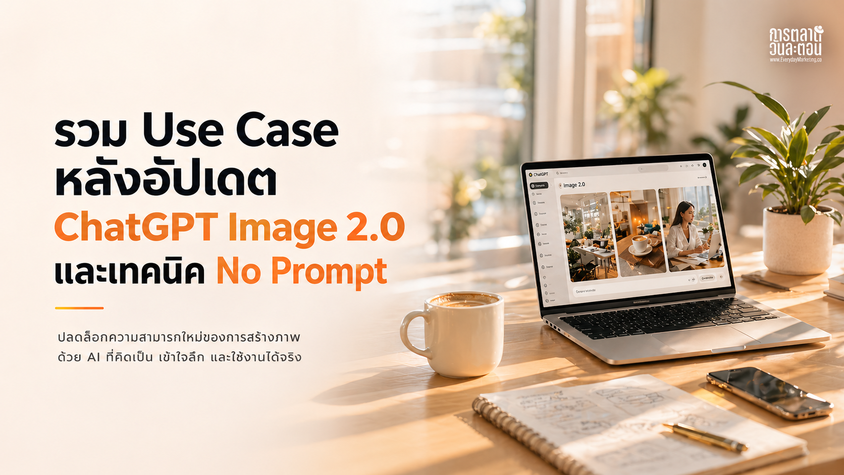
เมื่อ AI ไม่ได้แค่สร้างภาพ รวม Use case น่าสนใจ จาก ChatGPT Image 2.0
สิ่งที่เห็นชัดที่สุดหลังอัปเดตนี้ คือ use case ที่เกิดขึ้นจริง ไม่ใช่แค่ demo และเมื่อเอามาเรียงกัน จะเห็น pattern บางอย่างที่น่าสนใจมาก
Use case 1: Personal Color Analysis จาก ChatGPT Image 2.0
หนึ่งใน use case ที่ถูกพูดถึงเยอะ คือการเอารูป portrait เข้าไป แล้วให้ AI วิเคราะห์ personal color สิ่งที่ได้ไม่ใช่แค่คำตอบว่าเหมาะกับสีอะไร แต่เป็น output ที่ครบระดับใช้งานได้ทันที ทั้งการระบุ season อย่าง Soft Summer การแนะนำสีที่เหมาะและไม่เหมาะ การทำภาพ comparison ให้เห็นผลลัพธ์จริง รวมถึง layout ที่เป็น infographic พร้อมใช้
PROMPT: "Create a personal color analysis graphic using this portrait. Show side-by-side clothing color comparisons to highlight which colors suit the subject best. Make it visual-first, with short labels only and no paragraphs."
Use Case 2: วิเคราะห์โหงวเฮ้ง + ปรับลุค จาก content กลายเป็น product
อีก use case ที่น่าสนใจคือสาย personal branding และ beauty จากรูปเดียว AI สามารถ generate ออกมาเป็นการวิเคราะห์โหงวเฮ้งแบบมีจุดชี้บนใบหน้า การสรุปบุคลิกและแนวโน้มชีวิต การให้คะแนนในมิติ เช่น งาน เงิน ความสัมพันธ์ รวมถึงคำแนะนำทรงผมและกรอบแว่น พร้อมภาพตัวอย่าง
สิ่งที่เกิดขึ้นตรงนี้สำคัญมาก เพราะมันทำให้ content ไม่ได้เป็นแค่สิ่งที่ดู แต่กลายเป็นสิ่งที่มีมูลค่าและขายได้ ใครที่ทำสาย consultant หรือ personal brand สามารถเปลี่ยนสิ่งนี้ให้กลายเป็น service ได้ทันทีครับ
Create a single ultra-clean premium minimalist vertical brand presentation board in exact 9:16 aspect ratio. Flat 2D editorial layout (not 3D, not photographed). White or soft neutral background with very subtle grid alignment. High-end branding agency presentation style with strong hierarchy, controlled spacing, and balanced negative space.
---
STRUCTURE (STRICT)
Divide vertically into 3 sections:
* TOP SECTION - Framework: 18% height (lightweight)
* MIDDLE SECTION - Design System: 32% height (structured)
* BOTTOM SECTION - Applications: 50% height (dominant)
Visual weight must increase from top > bottom.
---
CORE INTENT
This is NOT a logo showcase.
This is a brand system presentation.
The board must clearly communicate:
reference > system > real-world application
---
REFERENCE & LOGO RULE
Use the uploaded image as the brand origin.
* Derive: color, tone, proportions, visual character
* Extend: build a complete and usable design system from it
The logo must:
* appear accurately when used
* appear sparingly (not repeated decoratively)
* be used functionally, not as wallpaper
If any placement cannot reproduce the logo faithfully, leave a clean placeholder instead of inventing a new version.
---
SYSTEM EXPRESSION RULE (CRITICAL)
Brand consistency must come from:
* color system
* layout logic
* spacing
* shapes
* typography
NOT from repeating the logo.
---
COLOR RULE (BALANCED)
* Base palette must come from the uploaded reference
* Allow tonal expansion (lighter / darker / desaturated)
* Allow neutral support colors for usability
* No unrelated colors or trendy accents
---
VISUAL LANGUAGE RULE (ADAPTIVE)
Adapt based on the nature of the reference:
* If the logo is graphic / illustrated > show shapes, linework, patterns, composition rules
* If the logo is photographic > show lighting, tone, texture references
Never mix mismatched styles.
---
TOP SECTION - FRAMEWORK (18%)
Minimal, clean, low visual weight.
Title (compact, refined):
"Brand Framework 2026"
Include small version + date label aligned near the title.
Layout:
LEFT:
* small logo reference (origin marker)
* 1 short brand essence sentence
* 4–5 keywords
RIGHT:
* abstract directional diagram OR simple visual logic block
BOTTOM STRIP
* "Design Principles" (3 short, sharp statements)
* tiny contextual indicators (very minimal, no heavy icons)
---
MIDDLE SECTION - DESIGN SYSTEM (32%)
Clean modular grid.
Include:
* Logo Direction
  original logo + subtle evolution (same identity, not redesign)
* Color System
  5–6 swatches derived from logo + tonal expansion
* Typography
  display + body pairing 1 sample line (placeholder)
* Visual Language
  shapes, patterns, composition rules derived from the logo
RULE:
Avoid generic template-style layouts. Everything must feel connected to the reference.
---
BOTTOM SECTION - APPLICATIONS (50%)
Dominant, high-density section.
Use a clean structured grid to show 6 - 7 realistic applications:
* Website hero
* Social media post
* Product packaging
* Poster / flyer
* Coffee cup or merchandise
* Tote bag
* Signage OR mobile UI (choose one for consistency)
---
APPLICATION RULE (IMPORTANT)
Do NOT just place the logo on objects.
Applications must demonstrate:
* consistent layout system
* color usage
* graphic language
* typography hierarchy
The brand must feel like a complete system.
---
APPLICATION BACKGROUND
Use the primary dominant color from the logo as the base tone of this section.
Mockup objects remain neutral and readable on top of it.
---
VISUAL ESCALATION (CRITICAL)
* Top: minimal, airy, low contrast
* Middle: structured, moderate detail
* Bottom: dense, high contrast, visually dominant
Section 3 must contain more visual information than Sections 1 and 2 combined.
---
FINAL LINE (BOTTOM)
"Built to work beyond the board."
---
AVOID
* logo repetition / logo wallpaper
* empty or weak application section
* over-designed framework section
* messy collage
* generic infographic icons
* unrelated colors
* inconsistent mockup styles
* forcing wrong visual language type
---
PRIORITY ORDER
1. section proportions (18 / 32 / 50)
2. top-to-bottom visual escalation
3. system consistency over logo repetition
4. color derived from reference
5. logo accuracy when used
6. overall polish
---
FINAL GOAL
A creative director-level branding board where:
the reference becomes a system
and the system becomes a real-world brand
Aspect ratio 9:16, ultra high resolution, presentation-ready.
------------------
End
Use Case4 4: Editorial Layout ที่ไม่ใช่แค่ภาพ แต่คือ “งานสื่อจริง”
อีก use case ที่ชัดมากคือการทำ editorial หรือ magazine layout จาก prompt เดียว AI สามารถสร้าง ทั้งภาพหลัก headline, hierarchy ของตัวอักษร, composition ของทั้งหน้า ซึ่งมันไม่ใช่แค่การสร้างภาพอีกต่อไป แต่มันคือการสร้างงานสื่อที่พร้อมเผยแพร่
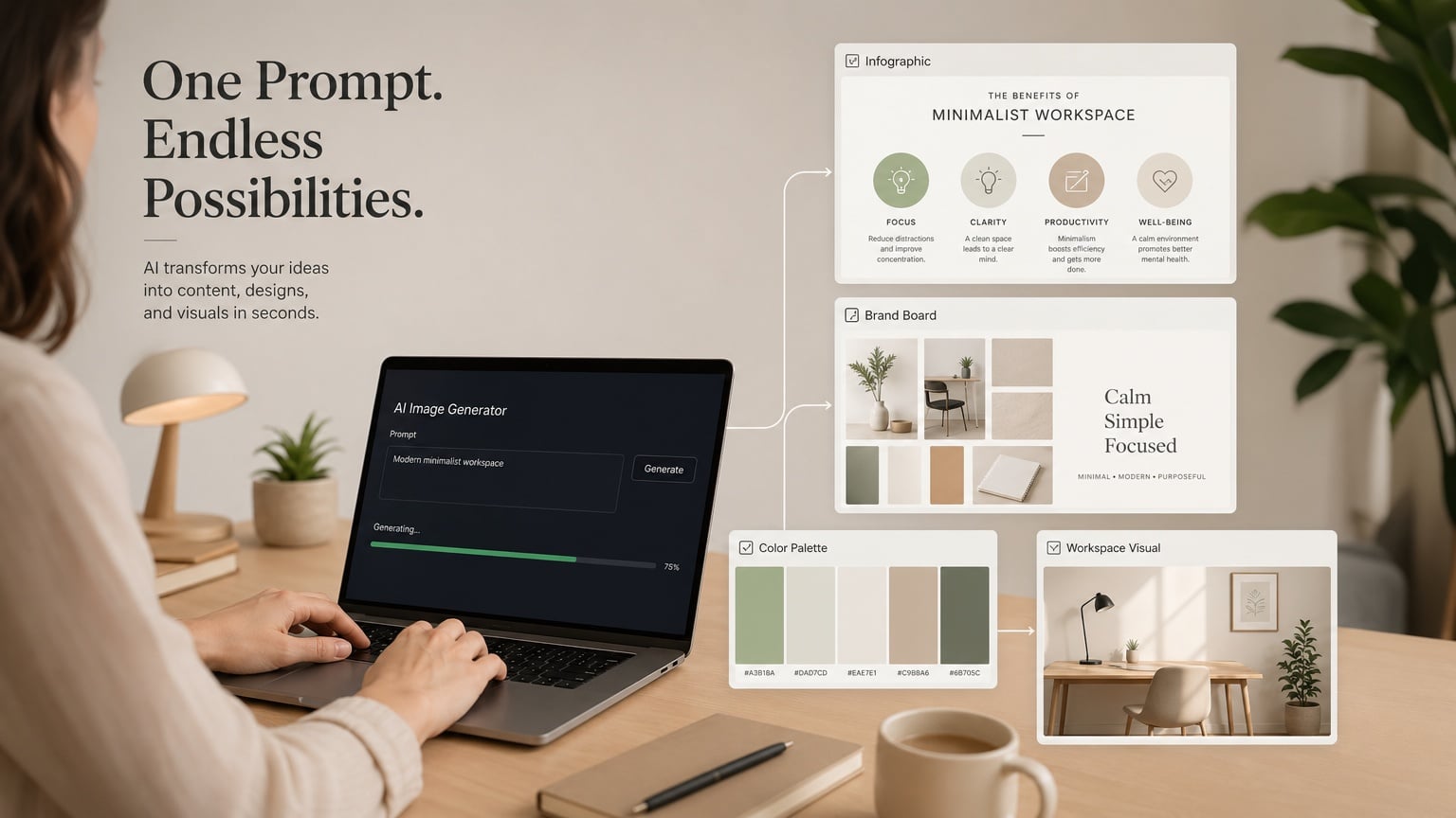
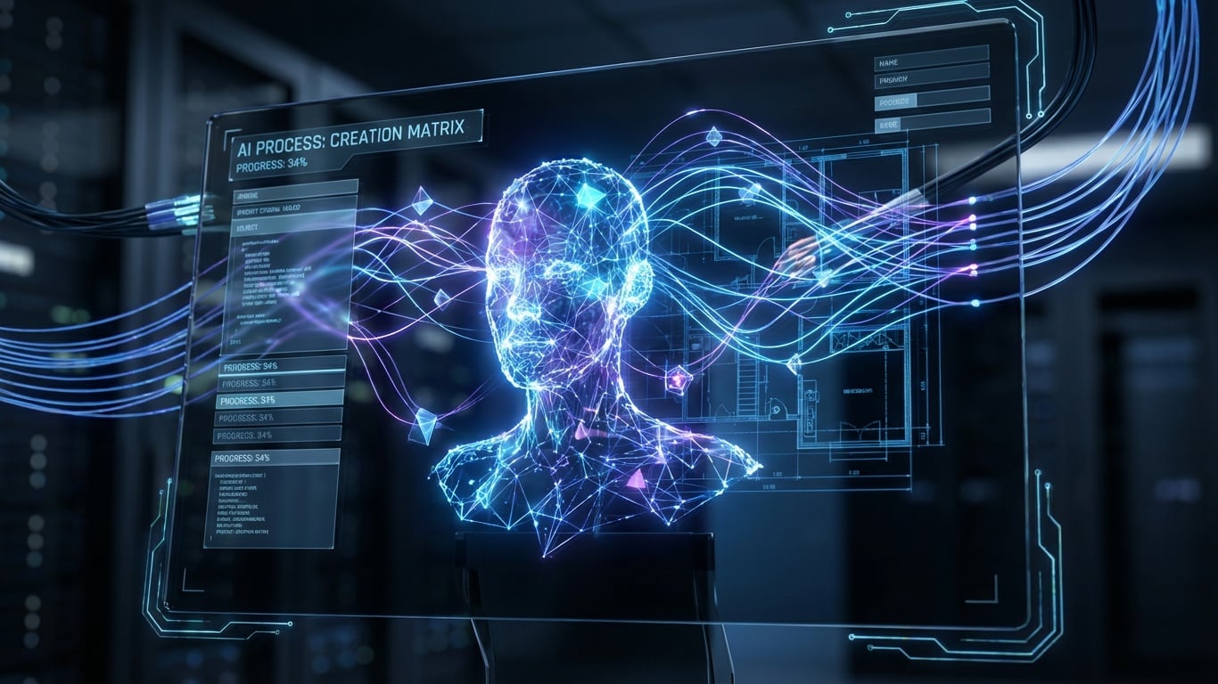
ขอบคุณภาพจาก Shutterstock AI Generator modern AI workflow concept, person using laptop generating multiple visual outputs from a single prompt, infographic, brand board, color palette, clean workspace, minimal aesthetic, warm neutral background, soft lighting, professional marketing concept, high resolution, commercial stock photo style
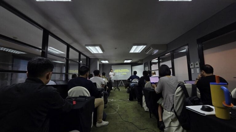
ส่วนใครเห็น CustomGPT ที่ผมสร้างแล้ว อยากสร้าง AI ของตัวเองไม่ว่าจะช่วยงานไหน งานอะไรที่ต้องทำทุกวัน คิดทุกวันแบบที่ผมทำ ตอนนี้ผมเปิดคลาสสอนสร้าง Personalized AI ด้วย ChatGPT / Gemini ที่จะเน้นสอนหลักการคิดแบบ Logical Thinking หรือการคิดอย่างเข้าใจ AI แทนการสอน Prompt ที่ใครๆ ก็ทำกัน
ส่วนตัวผมพบว่าถ้าเข้าใจ Logical Thinking เรื่องเดียวจะประยุกต์ใช้กับ AI ตัวไหนก็ได้ คลาสนี้จึงเน้นการสอนหลักคิด และสอนให้คุณได้สร้าง AI ของตัวเองในคลาส ถ้าสนใจตอนนี้เปิดรุ่นที่ 2 เรียนวันเสาร์ที่ 23/5 เรียนที่ลาดพร้าว 3 ครับ
ผมหวังว่าทุกคนจะนำการพัฒนาของเทคโนโลยีและบทความนี้ไปใช้ให้เกิดประโยชน์ ไม่มากก็น้อยนะครับ ฝากติดตามบทความด้านการใช้ AI แบบนี้ด้วยนะครับ หรือใครอยากให้นำ AI ตัวไหนมาเล่าให้ฟัง สามารถคอมเมนต์บอกกันได้เลยครับ
สำหรับนักอ่านที่ชอบ และ อยากอ่านบทความเกี่ยวกับการตลาด, Data และ AI เพิ่มเติม สามารถติดตามได้จาก เพจการตลาดวันละตอน รวมไปถึง Twitter Instagram YouTube ของการตลาดวันละตอนได้เลยนะครับ แล้วพบกันใหม่ในบทความหน้าครับ